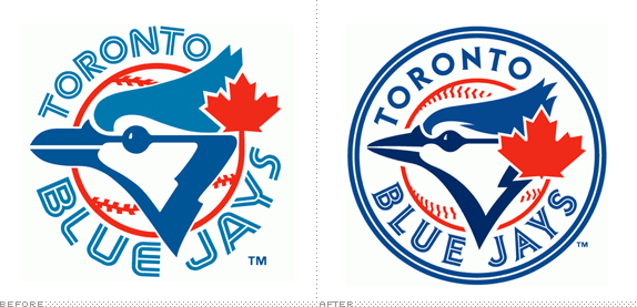
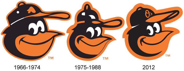
 It looks like we officially have a trend in baseball, at least with regards to the fashion worn on the field. On Friday, the Houston Astros unveiled their "new" logos to the fans, and I approve. Generally, I am on the positive side when it comes to fashion-forward uniforms, such as the many variations of the Oregon Ducks' football uniforms or the NFL's and NBA's obsession with replacing everything white on a jersey with black. Baseball has found a new way to make a fashion statement: go retro.
I guess the trend officially started last season when both the Orioles and the Blue Jays decided to revisit the glory days and remodel their logos after when they were most successful. For the Jays, it was the 1992-93 seasons, the only times they have appeared in (and won) a world series, along with the last time they even won the AL East. The Orioles returned to the cartoon bird, which brings back a time when they won their last AL pennant and world series (1983).
For the O's, the move was a clear success. By moving away from the design that hung over them during the worst years in franchise history, it was easy for the baseball world to love them again. A younger, spunkier team with a fun logo makes everyone want to hop on board the bandwagon.
 The Blue Jays had considerably less success, finishing the season with 89 wins, barely enough to not be in last place. They had shown a small spark the year before, which, much like the Orioles, probably triggered the move to the new logo. Unfortunately, the Blue Jays will have to wait their turn, as the AL East is still the toughest division in baseball.
Overall, I am really impressed with the changes. Making something new and different isn't always the way to go, and I'm glad that going back has worked for a few organization.

No comments:
Post a Comment